What is it? Three different timers were created then UX tested by five different users to understand the usability of each design.
When? Created 2017.
Who wants it? The audience for these apps would be anyone unhappy with their existing phone timer.
Where would this be used? This would be used wherever a timer is needed.
Why would someone want a different timer? These timers were created to be more accessible for users.
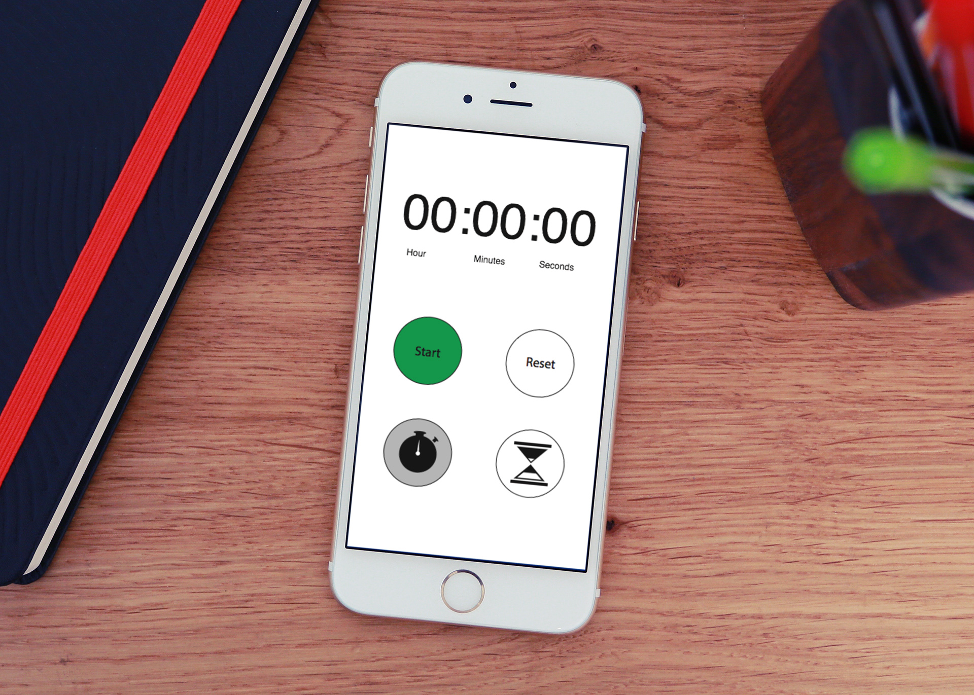
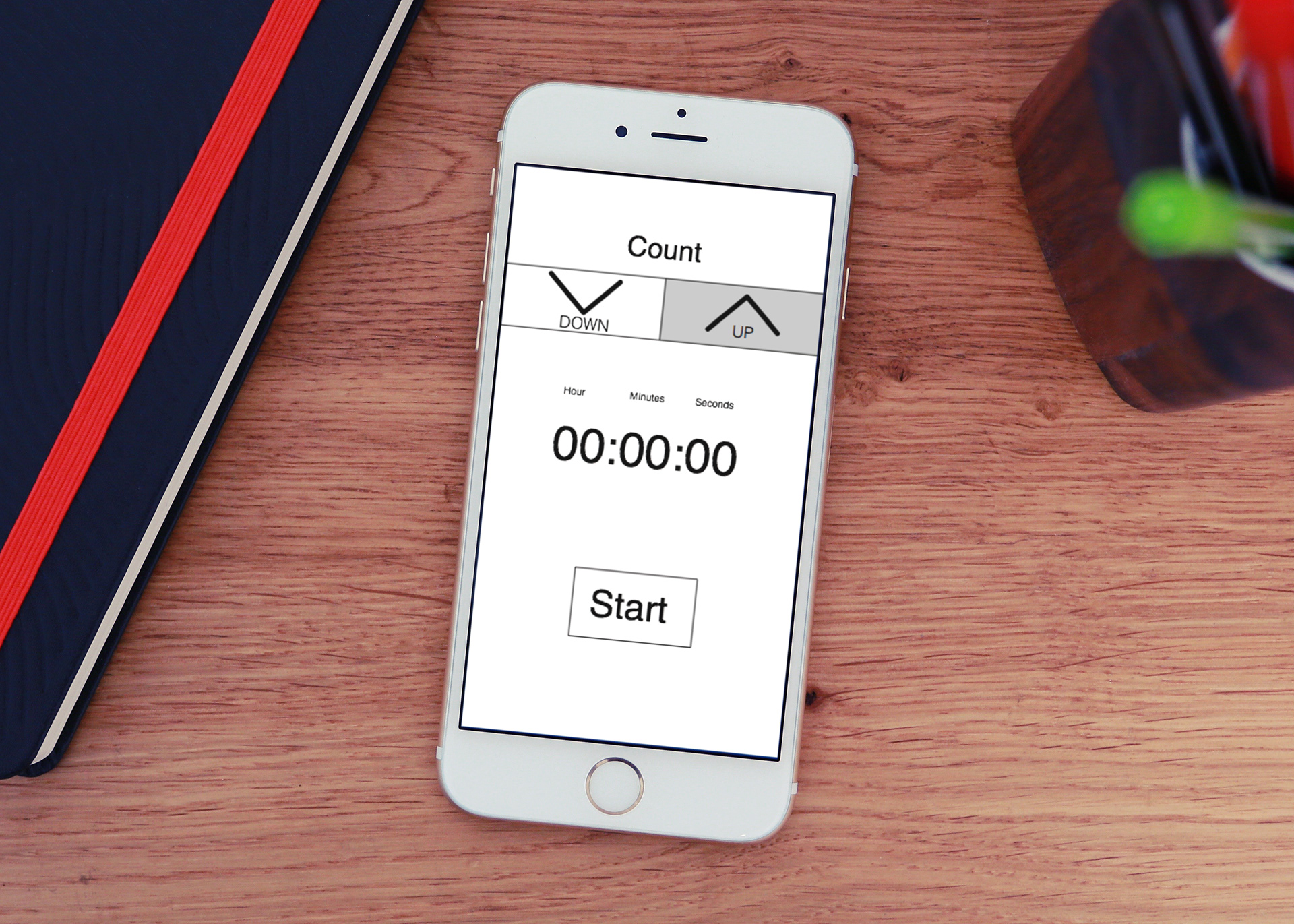
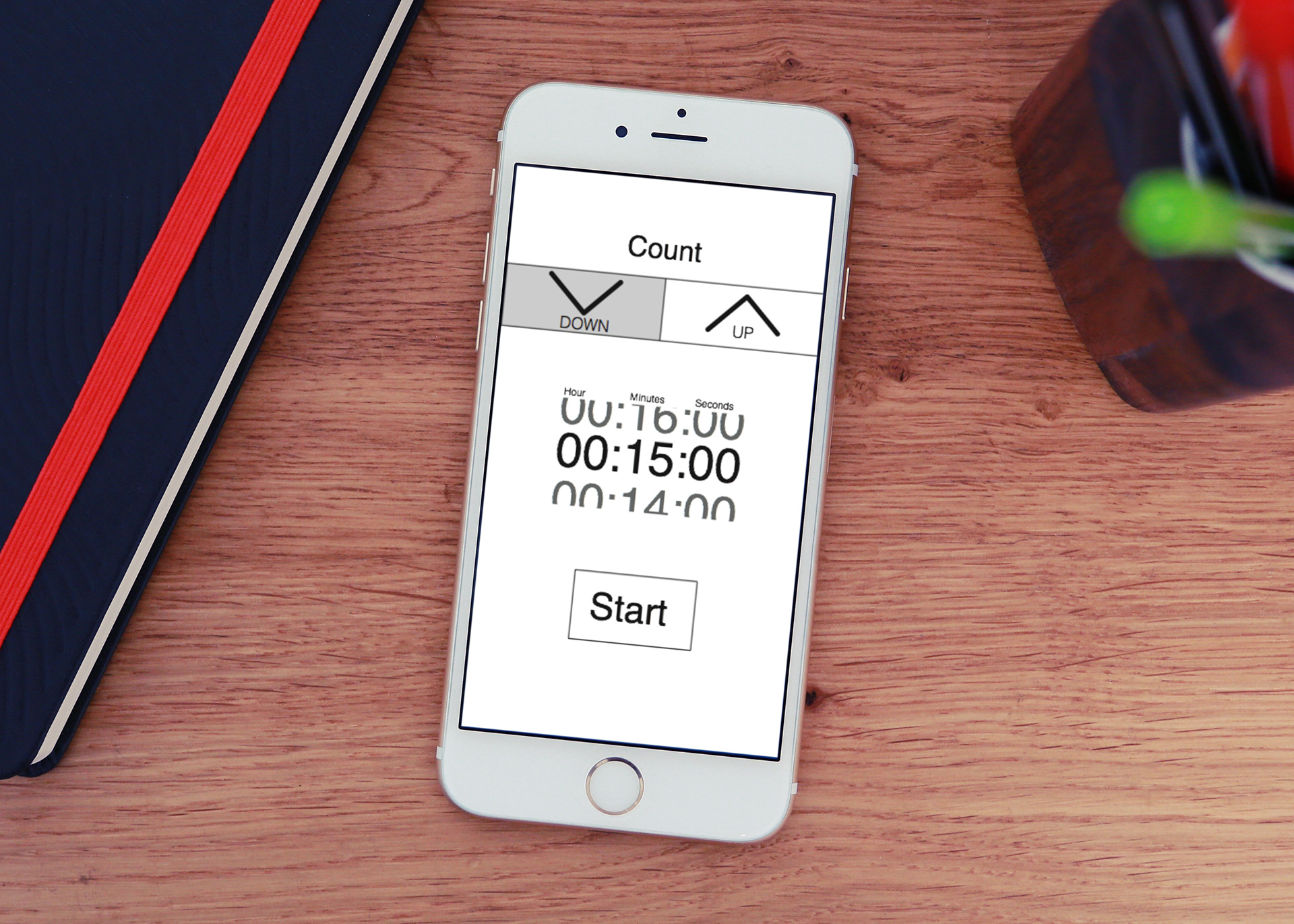
Timer 1 Close up
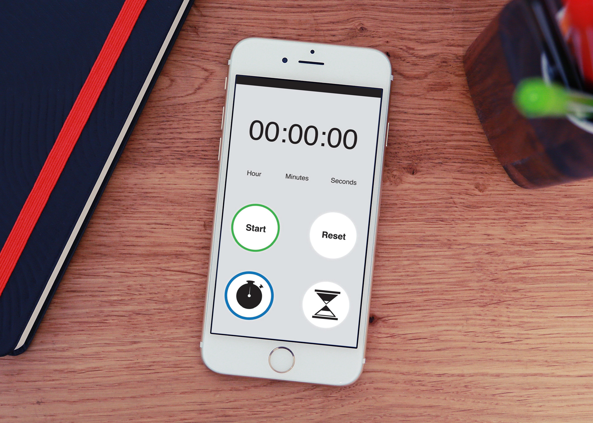
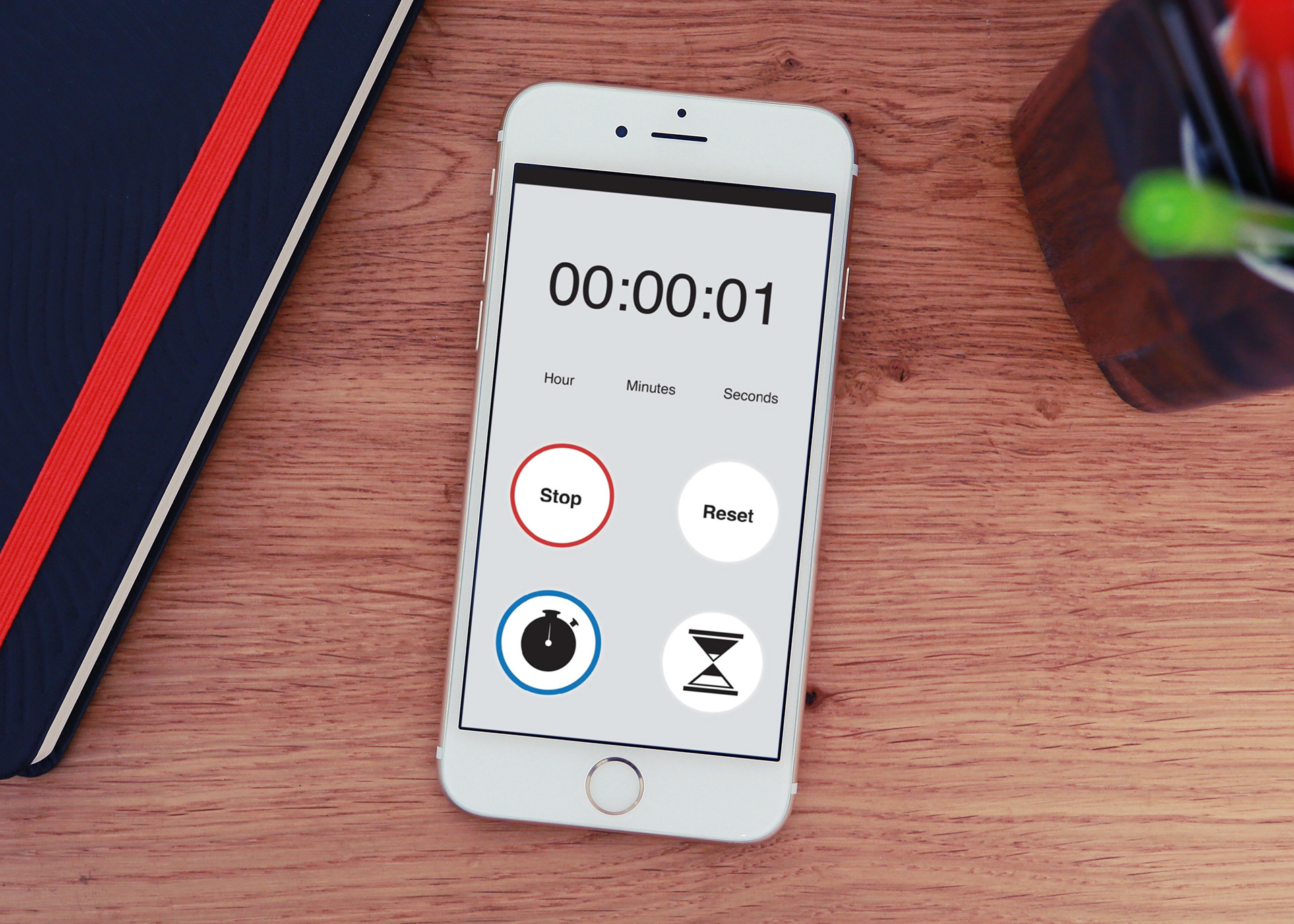
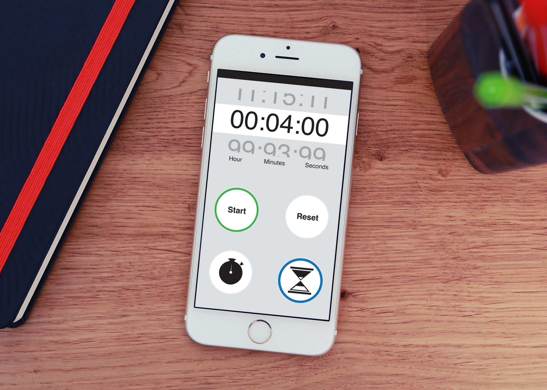
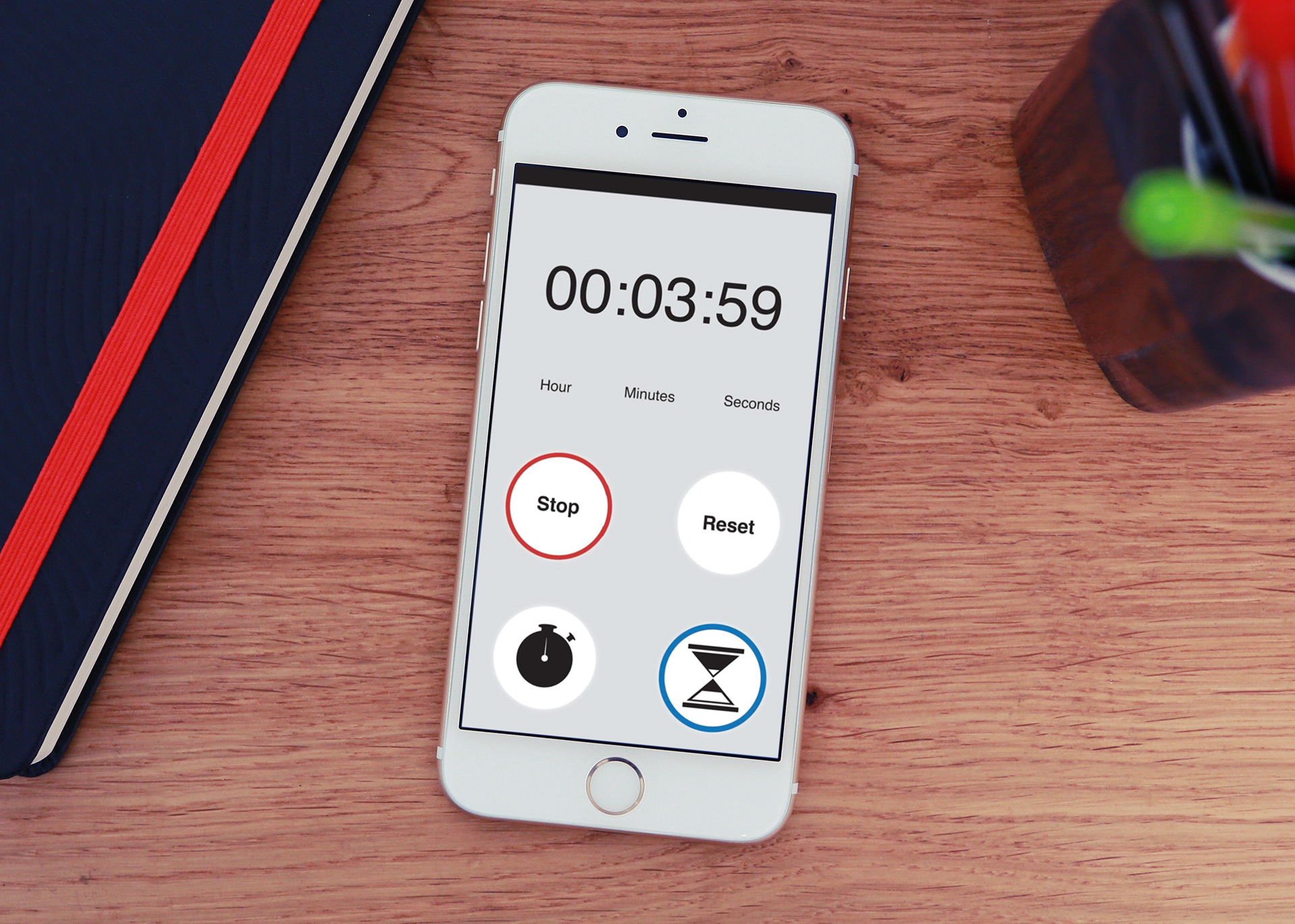
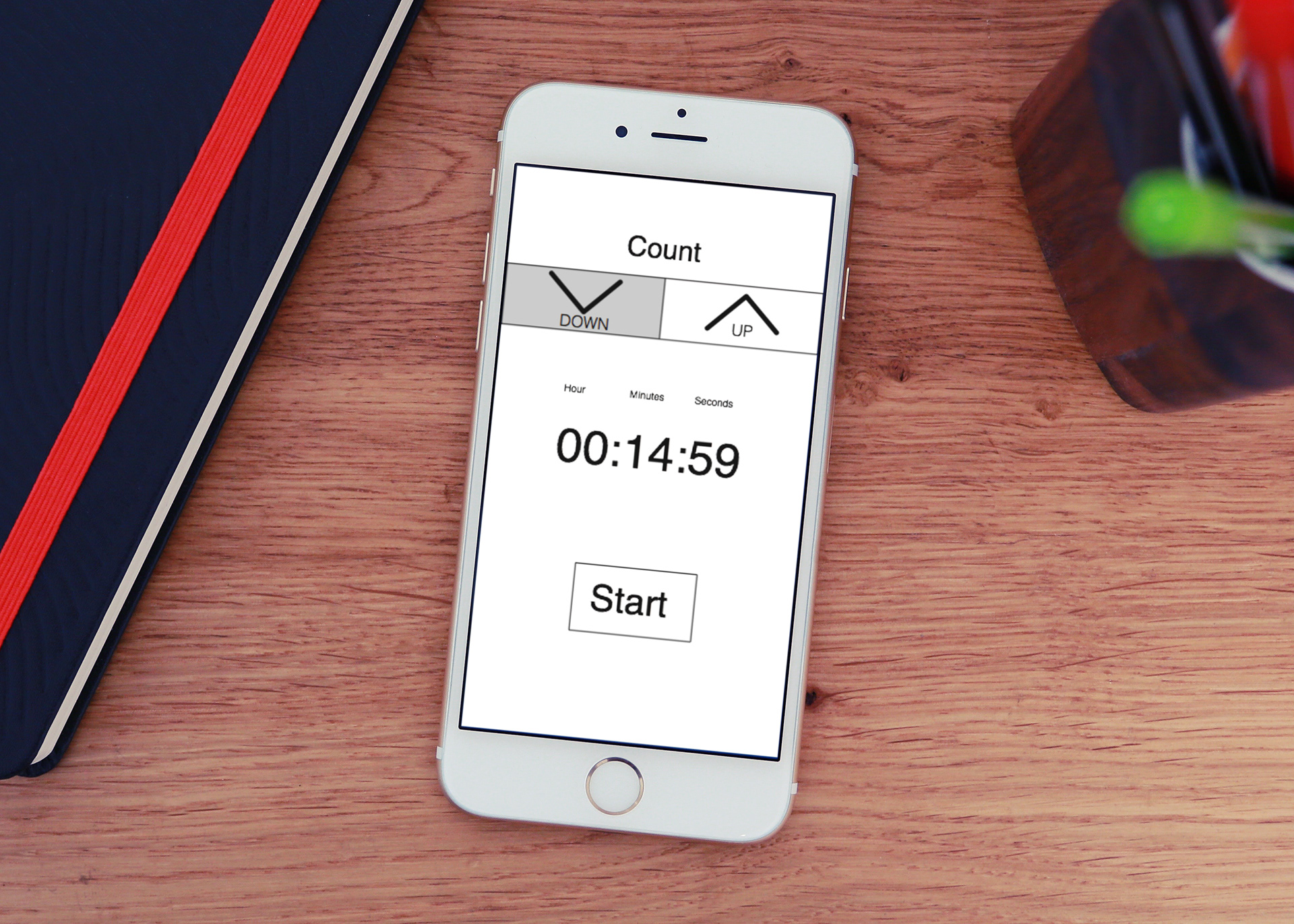
Timer 2 Close up
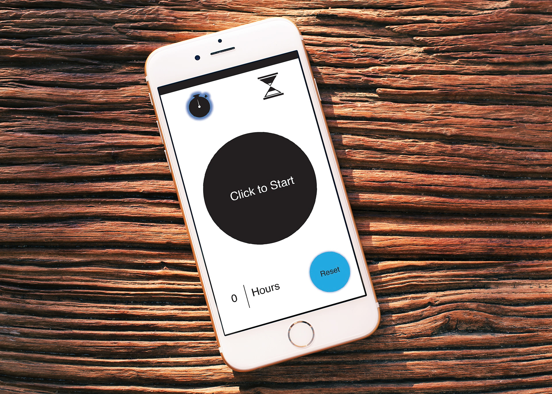
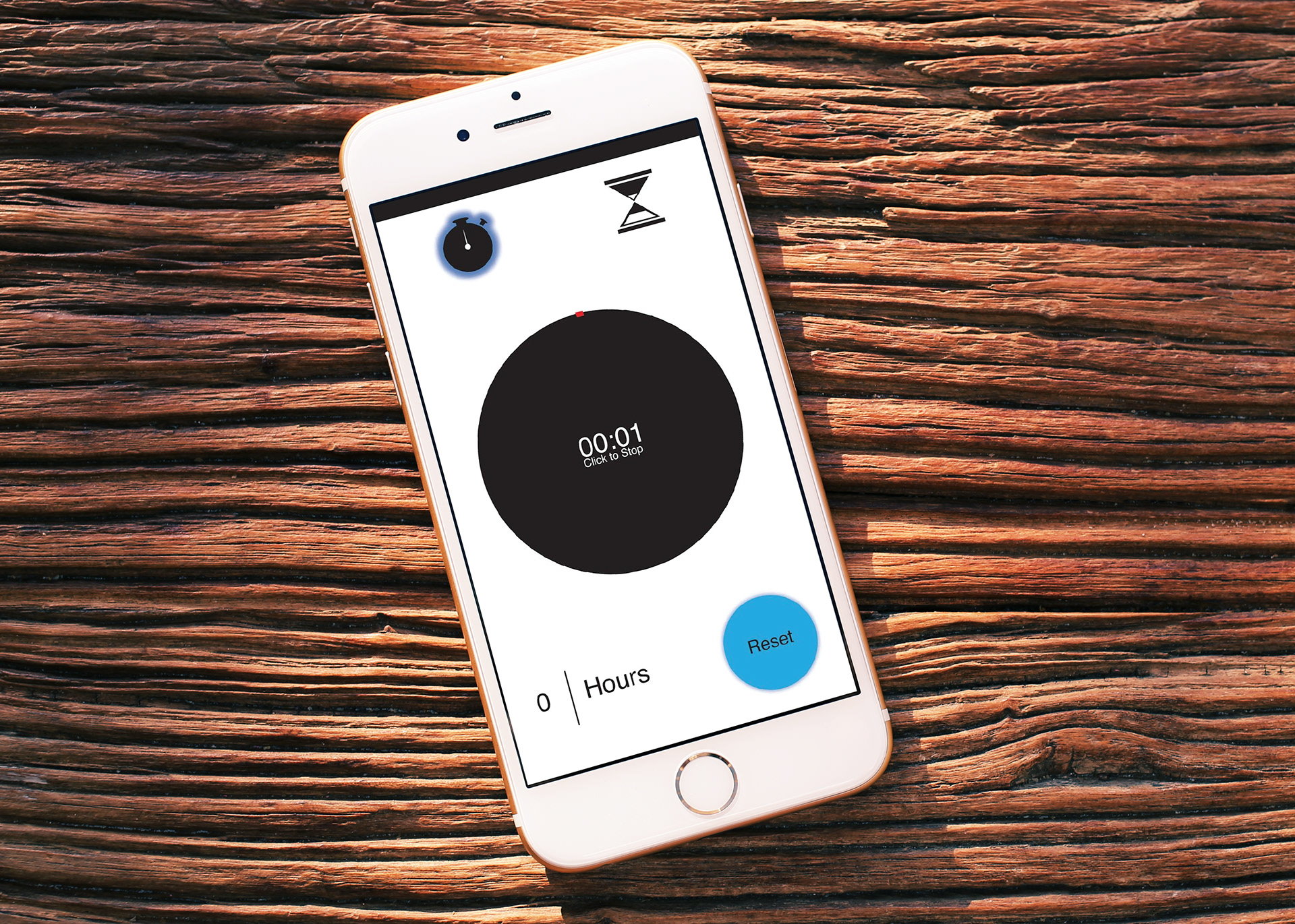
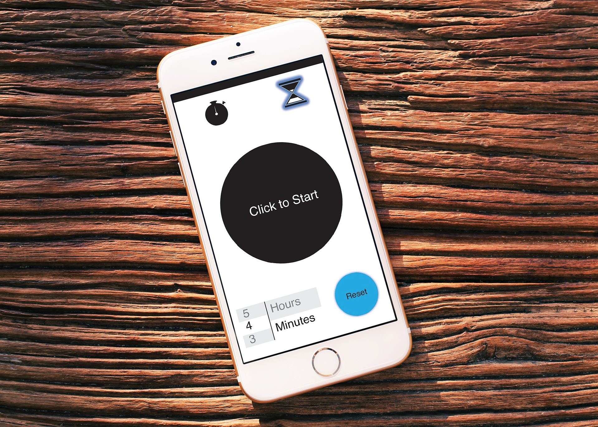
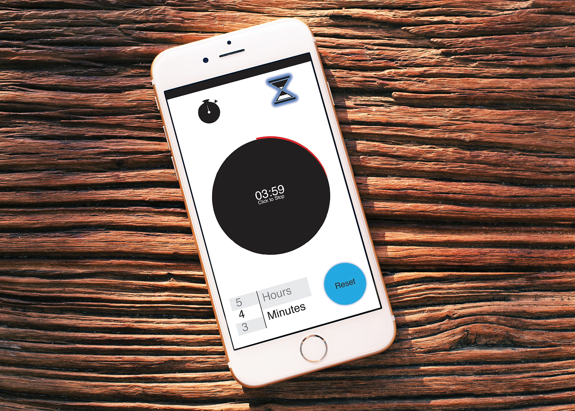
Timer 3 Close up
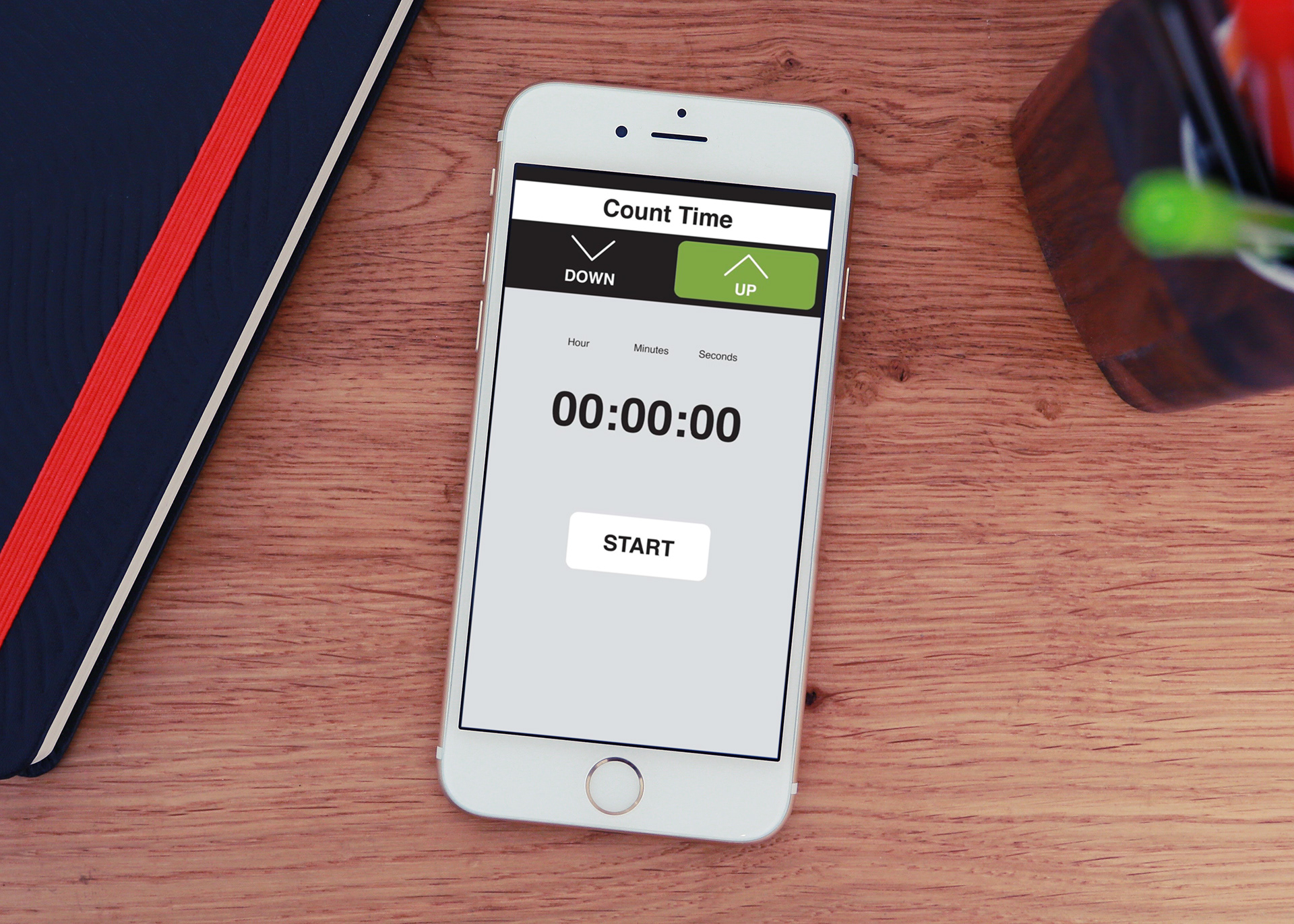
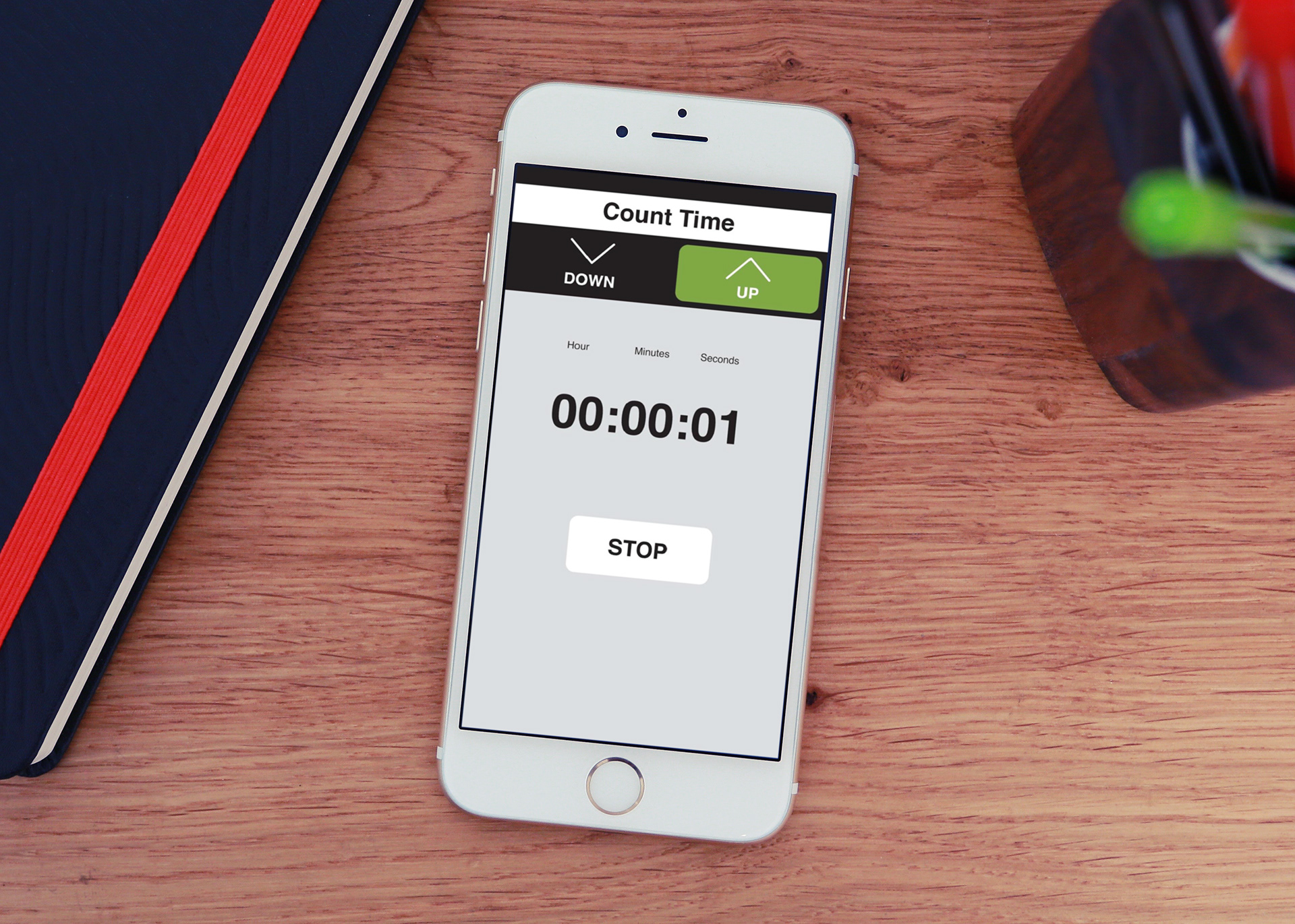
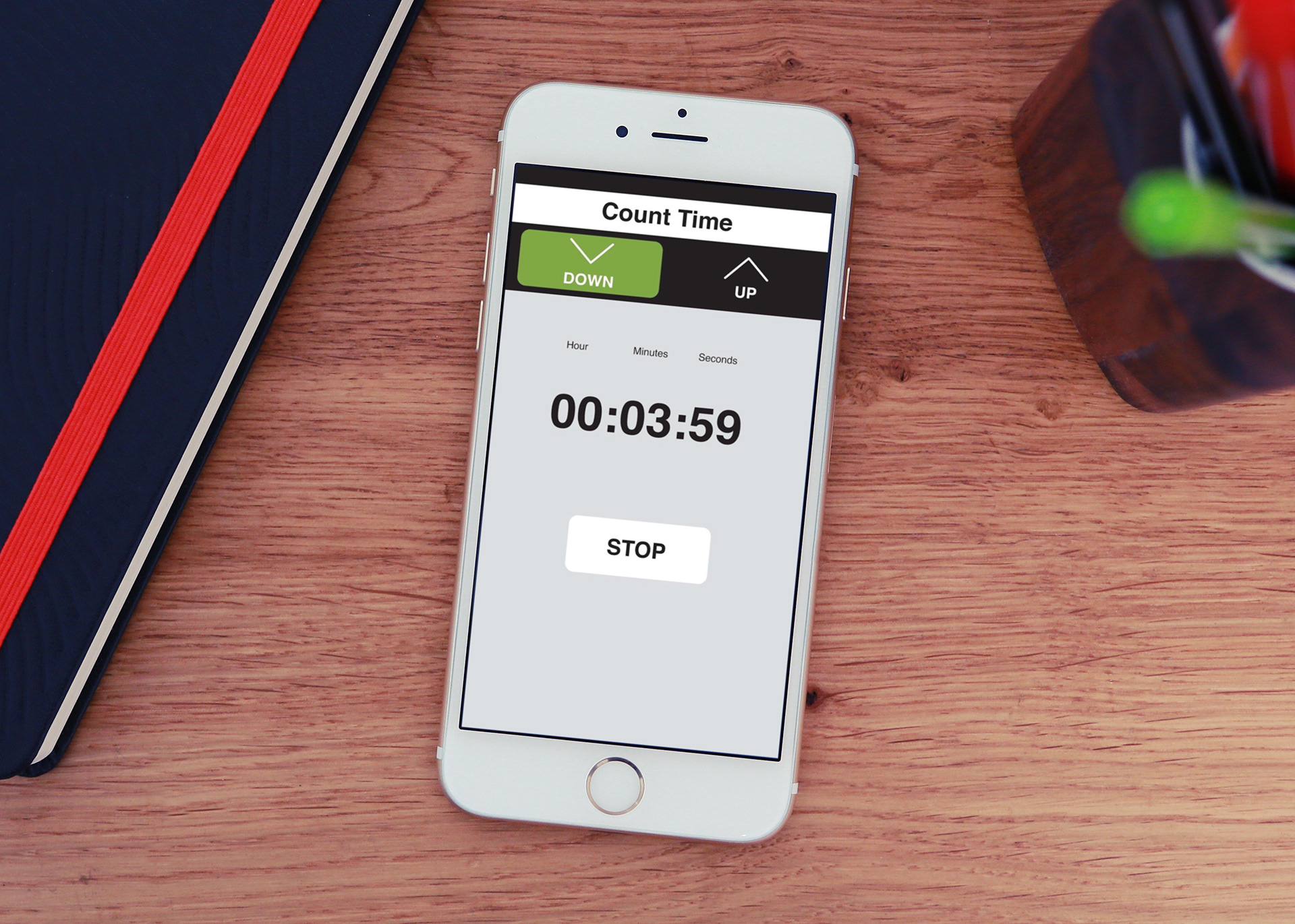
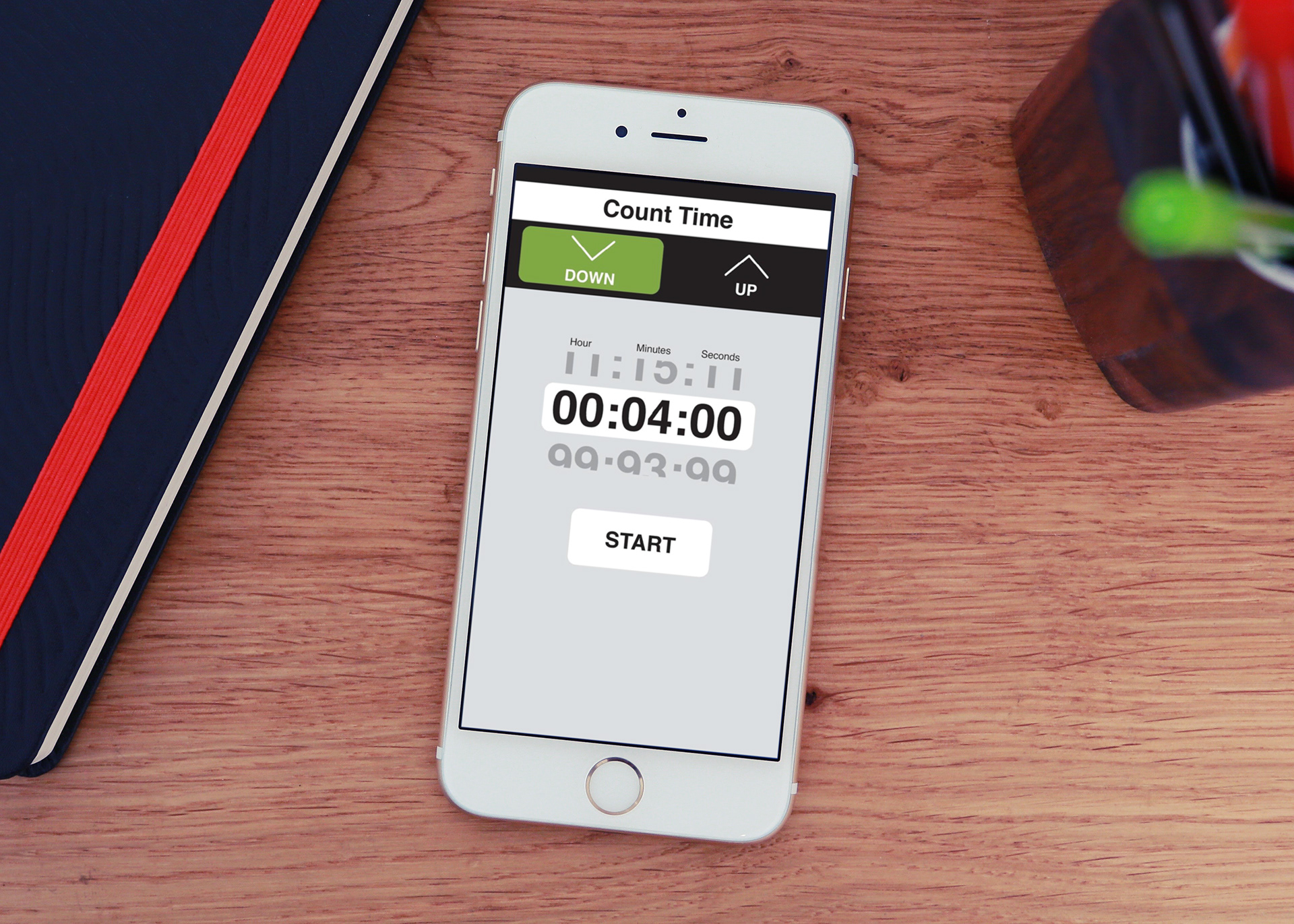
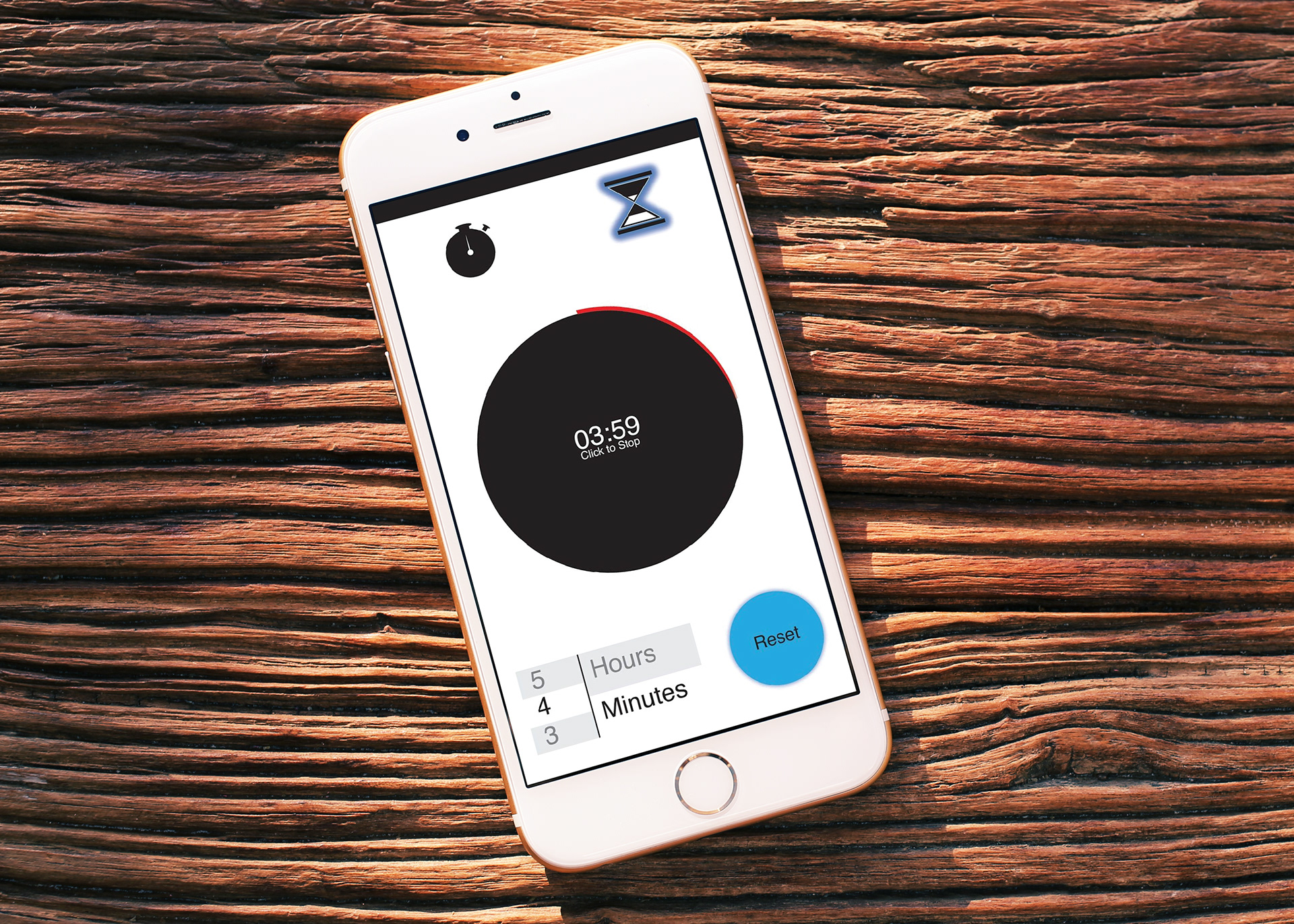
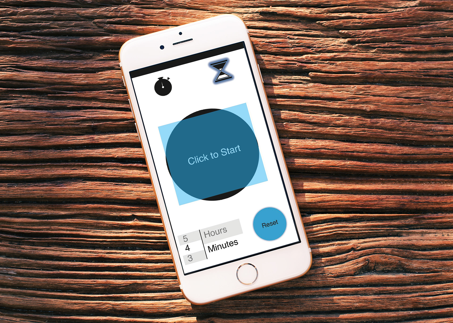
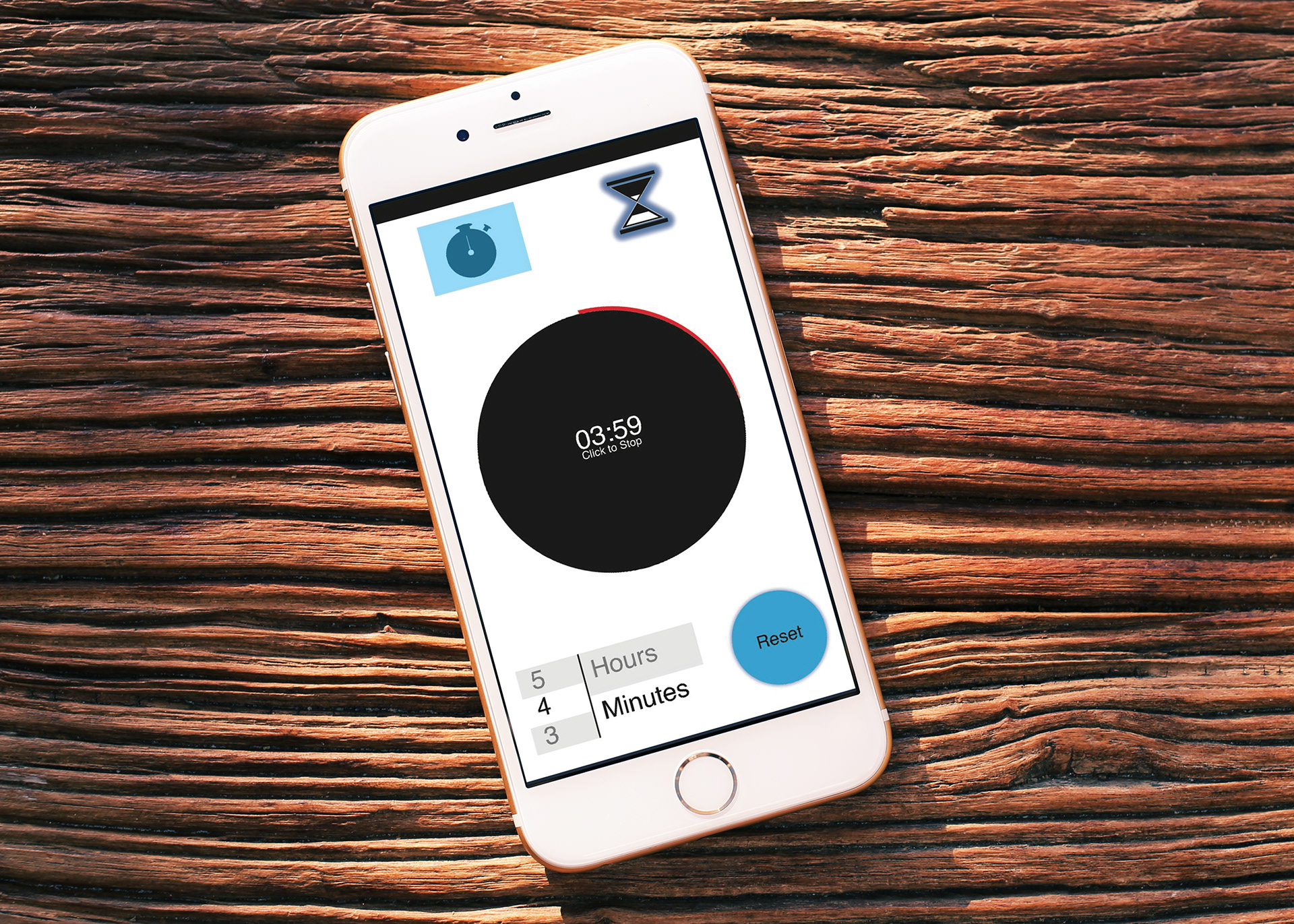
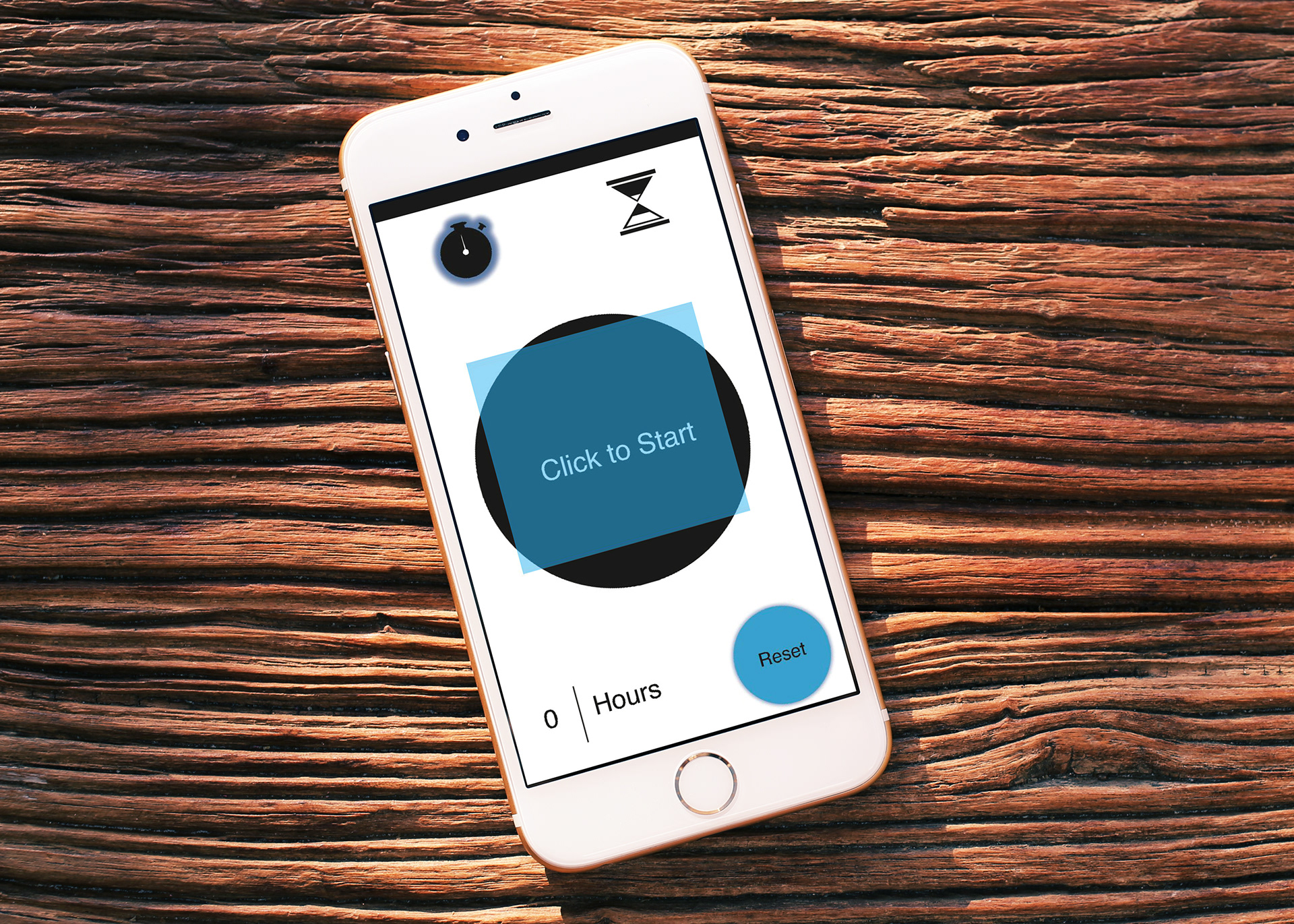
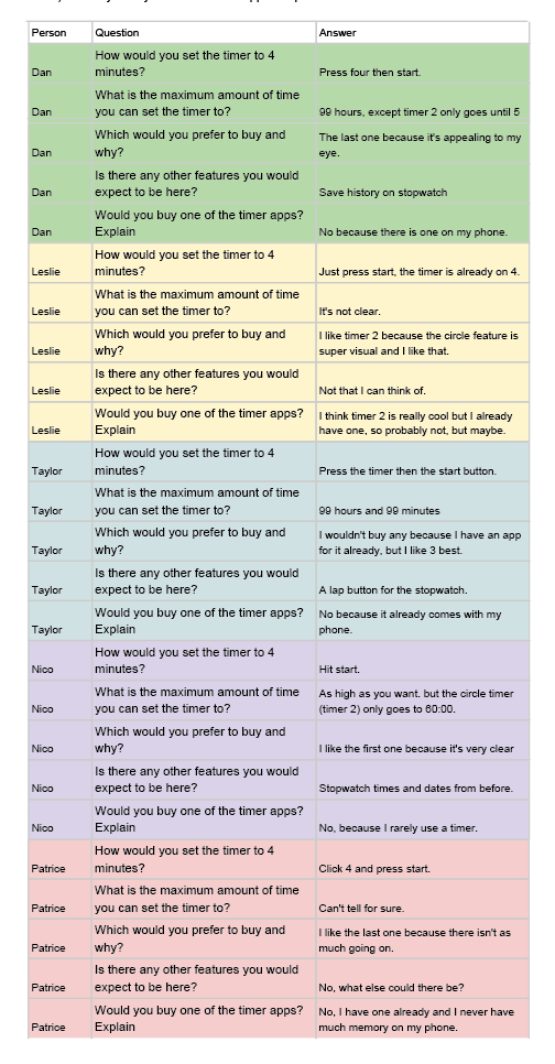
ANALYSIS OF UX TESTING After testing the five different users is it clear some things need work. Overall, the reviews were mixed. It’s possible to say majority of the mixed reviews spawned from the designer’s inference users would not reset their timers, and the timer would remain at the last set time. To begin, the testers were asked about timer one, then timer two, and lastly answered questions about timer three. When the user was testing timer one, the first question was asked–how would you set the timer to four minutes, there was a mixed set of responses. Everyone understood to press the start button, however majority tried to select another button before clicking the start button, one clicked the timer button, and two pressed the number four in the scroll before clicking the start button. This set of mixed resulted is most likely due to the designer’s inference users would prefer the timer to save the amount of time the timer was last set for. To avoid confusion it would be best to start the timer at 00:00 and allow the user to set the timer to the desired time. When the users were asked to start the timer at 4 minutes while testing timer two and timer three all of the users understood to only click the start button. It’s possible the users reacted this way, because the users who pressed other buttons before the start button while testing timer one, saw the blue box flash on the screen instead of their desired action. In other words, the user could have felt they did not press the right button during the first test, so they learned from the first test to only press the start button, when the timer was already selected on the number four. Then the responses for question two, what is the maximum amount of time you can set the timer to, were mixed results. All three timers used the same type of number scroll selector, so overall the responses for each timer were similar. Two of the users responded with unsure, because they could not scroll to see that far. Others users inferred the timer could be set to 99:99, since they could see part of the nine below the selected zeros. When this question was asked while testing timer three the users all responded in the same way they did in timer one. While testing timer two however, one user responded that the timer could only be set to 60:00. As noted before the addition of a 00:00 page, then have the user set to four minutes so the users can see and understand how the scroll works. As for question three–which would you prefer to buy, three people responded with timer three, and then one user said timer one and the last said timer two. Overall, when asked why they would buy they chosen one over the others, the users like that there wasn’t as much going on. The user who preferred timer two liked it because of the visual going around the circle and the user who preferred timer one liked how simple all the buttons were laid out. When the fourth question was asked, should there be any other features, answers were somewhat similar. Two users said no addition features were needed and the other two mentioned the stopwatch seem like it needed a history of previous stopwatch times. Another user felt the lap button needed to be there. Lastly, when the users were asked if they would buy any of the timers all of them but one replied with a strong no. Overall, it was because their phone already has a timer app, or they simply do not use a timer. Another user mentioned not having enough empty space on her phone for an app already on her phone. Even the user who slightly debated saying yes to buying it, still said no because she already has a timer on her phone. So overall, the test would have been better if the user was able to set the timers to four minutes rather than experiencing a saved preset of four minutes, from the previous use. In addition, testing more than five people would help to better understand the results. After creating and testing the digital timers, there were things noted when comparing the digital process to the manual timer process. First one similarity noted was after testing each analog and digital timer needed work. A difference noted between the two types of timers was the user responses to the question “What is the maximum amount of time the timer can be set to?” For the analog timers almost all of the users responded correctly, whereas the digital timers got various responses. This difference in responses from the two types of timers has to do with how each timer is set. Another thing noted to be different with the two tests was the users body language suggested the users were much more cautious when they answered questions about the digital timers. Perhaps this suggests cautiousness came from the users physical interaction with the timer.
How was it made?
Step 4 FINALIZATION
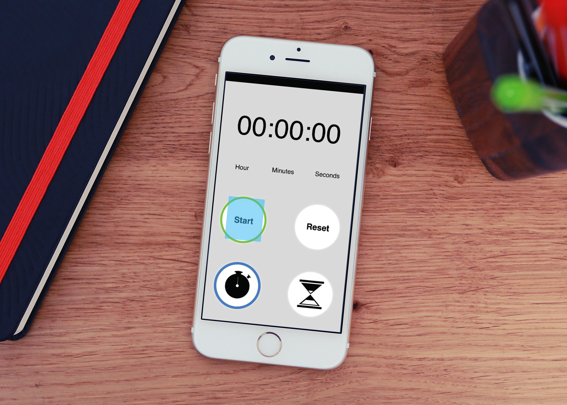
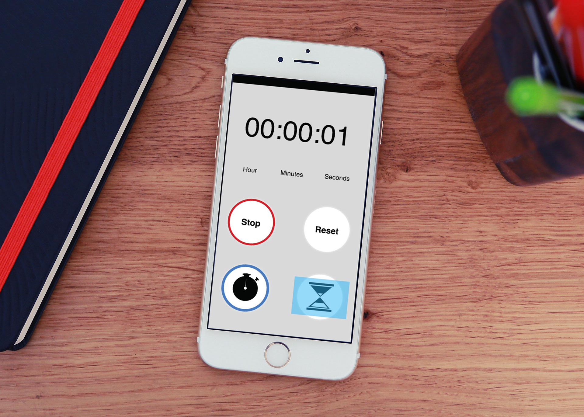
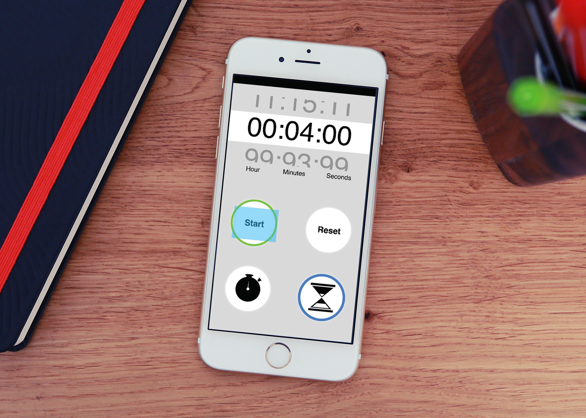
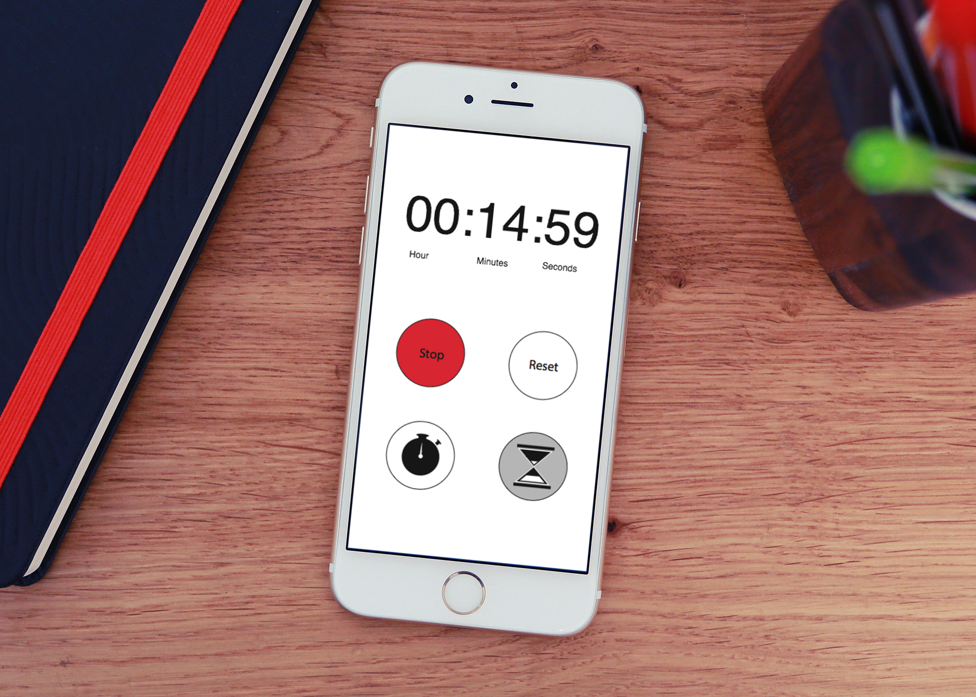
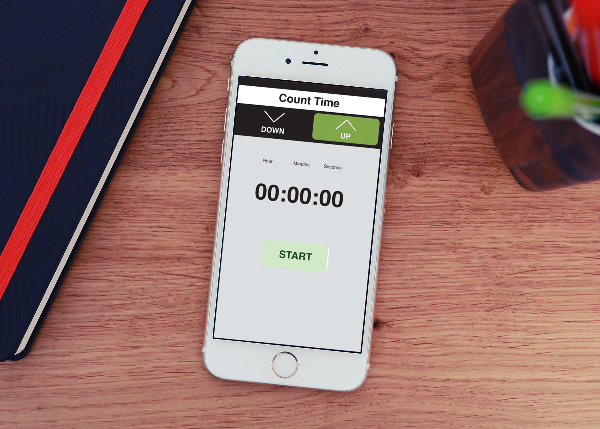
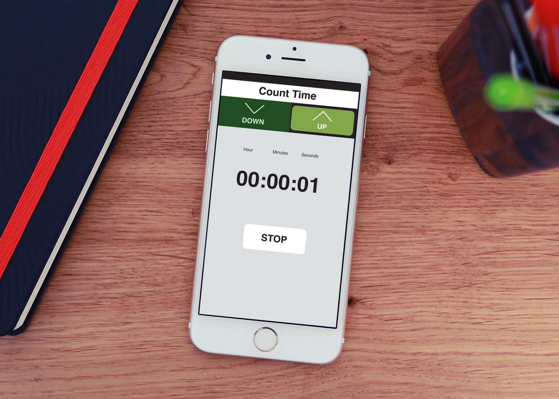
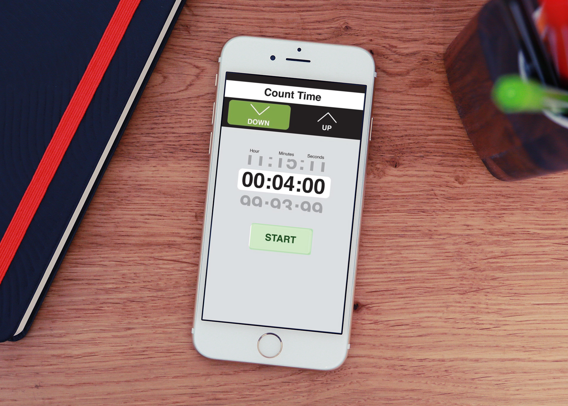
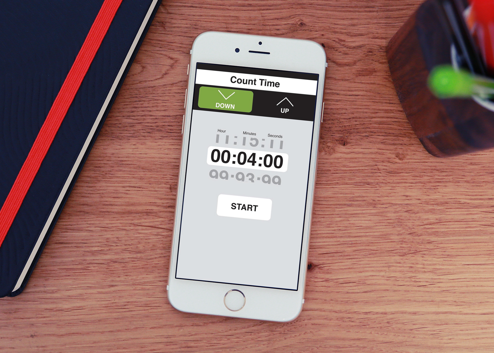
THE DESIGNED PATHS ARE SHOWN BELOW IN THE BLUE OR GREEN HIGHLIGHTED AREAS. CONSISTENT DIRECTIONS, LIKE START OR STOP TIMER, WERE GIVEN TO USERS IN ORDER TO WALK THEM THROUGH EACH VARYING TIMER.
Timer 1
Timer 2
Timer 3
Step 3 FEEDBACK
TEST SCRIPT USED AFTER TESTING
1.) How would you set the timer to 4 minutes?
2.) What is the maximum amount of time you can set the timer to?
3.) Which would you prefer to buy and why?
4.) Is there any other features you would expect to be here?
5.) Would you buy one of the timer apps? Explain.
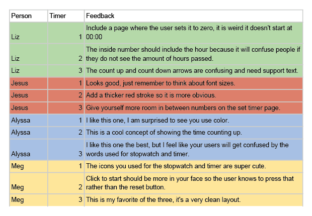
FINAL TIMER FEEDBACK
FIRST ROUND TIMER DESIGN FEEDBACK
Step 2 IDEATION
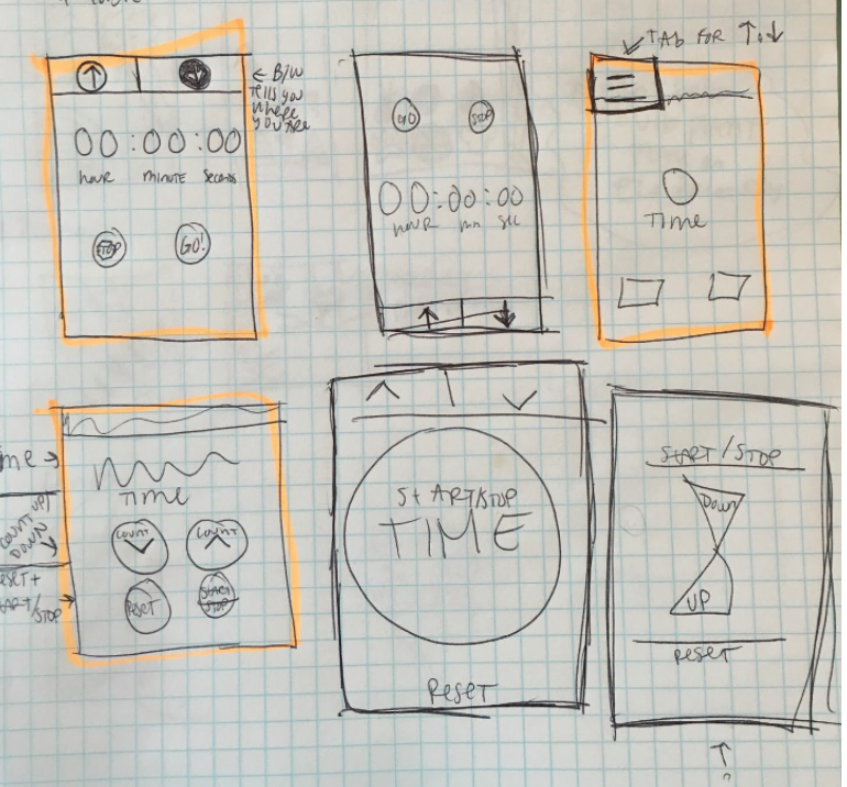
FIRST ROUND OF TIMER DESIGNS.
Timer 1 Close up
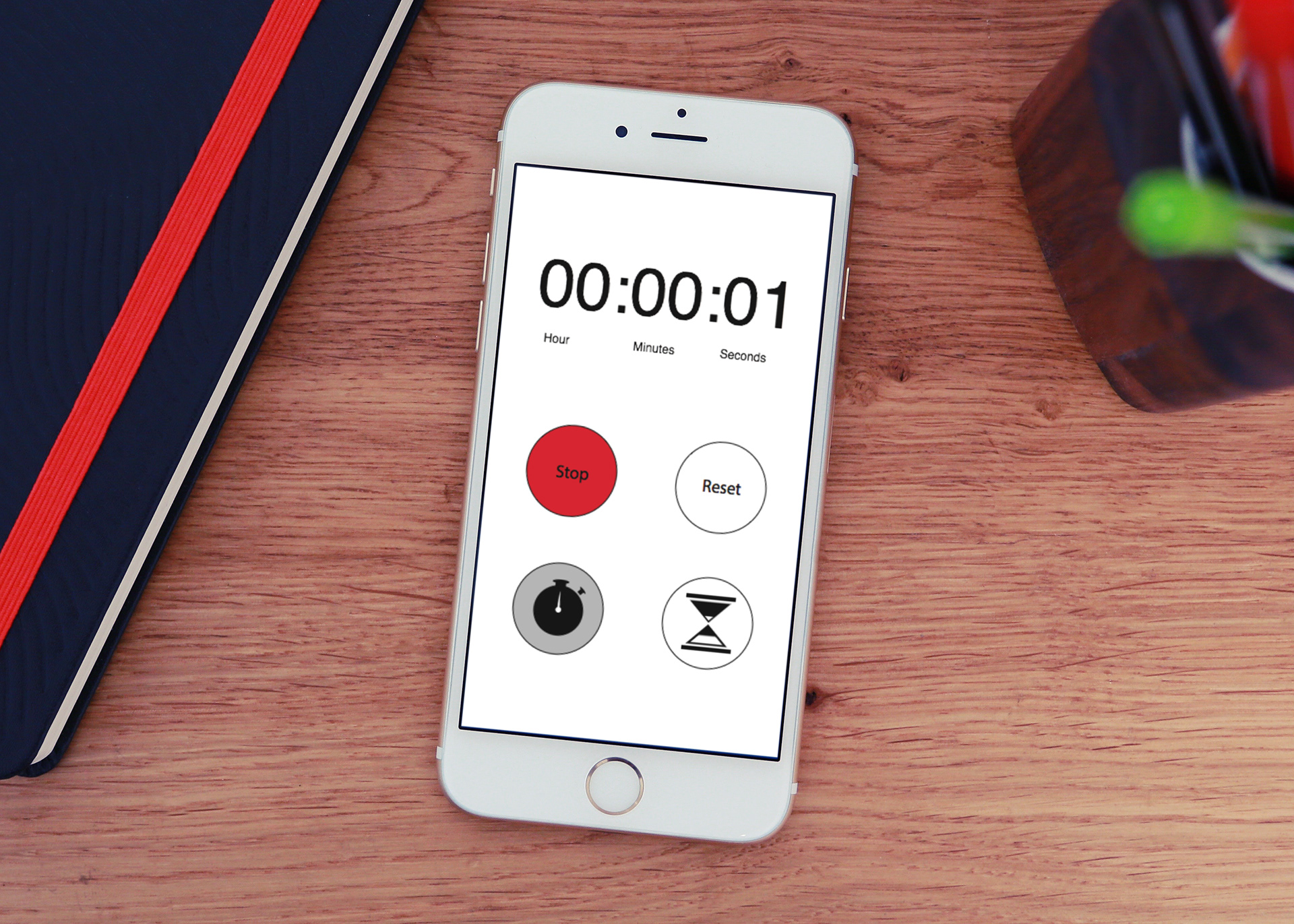
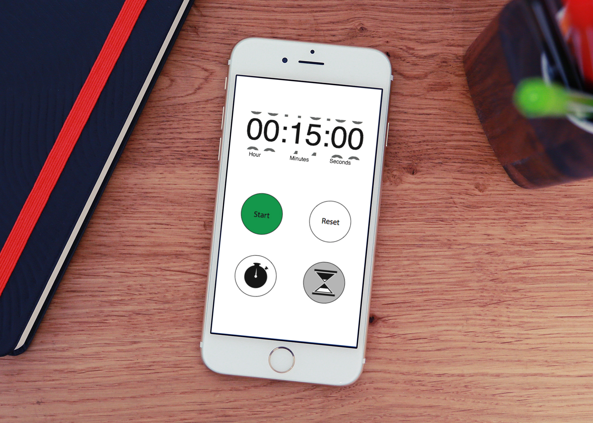
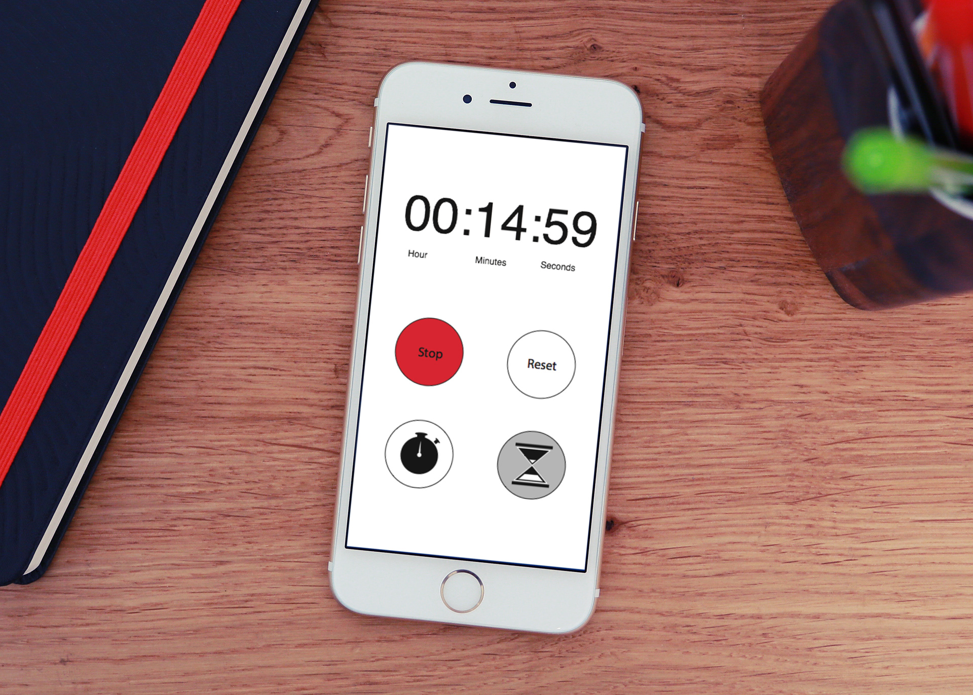
Timer 2 Close up
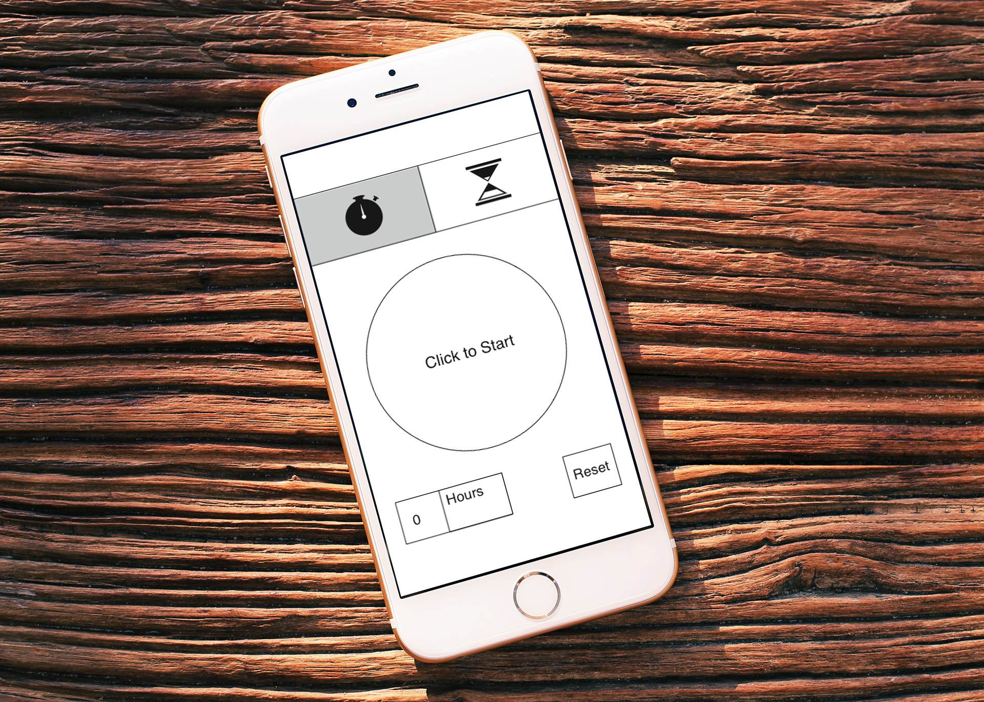
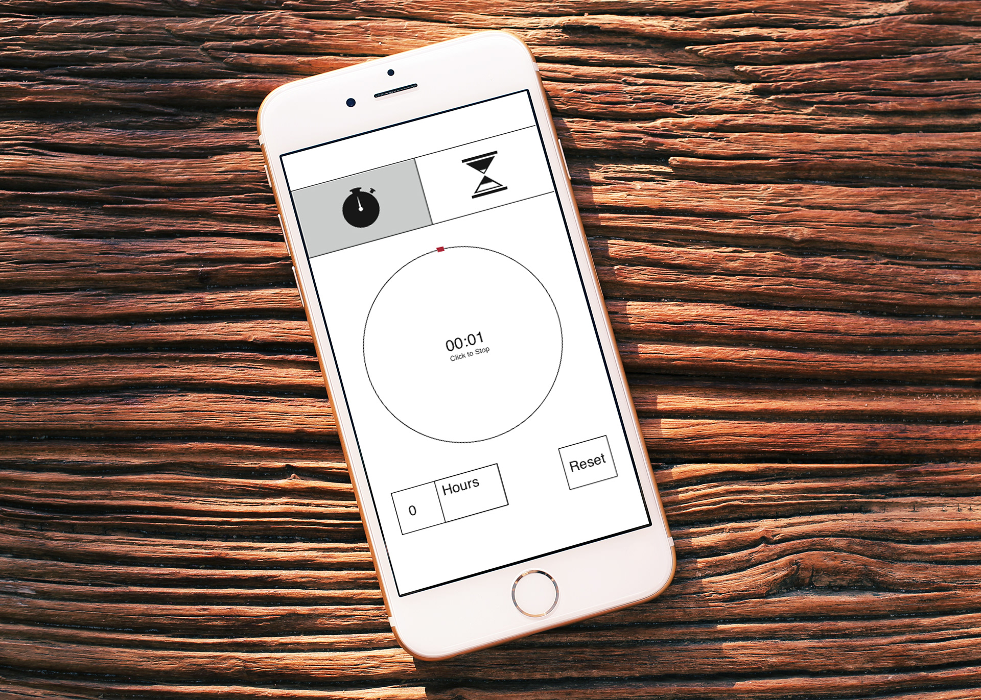
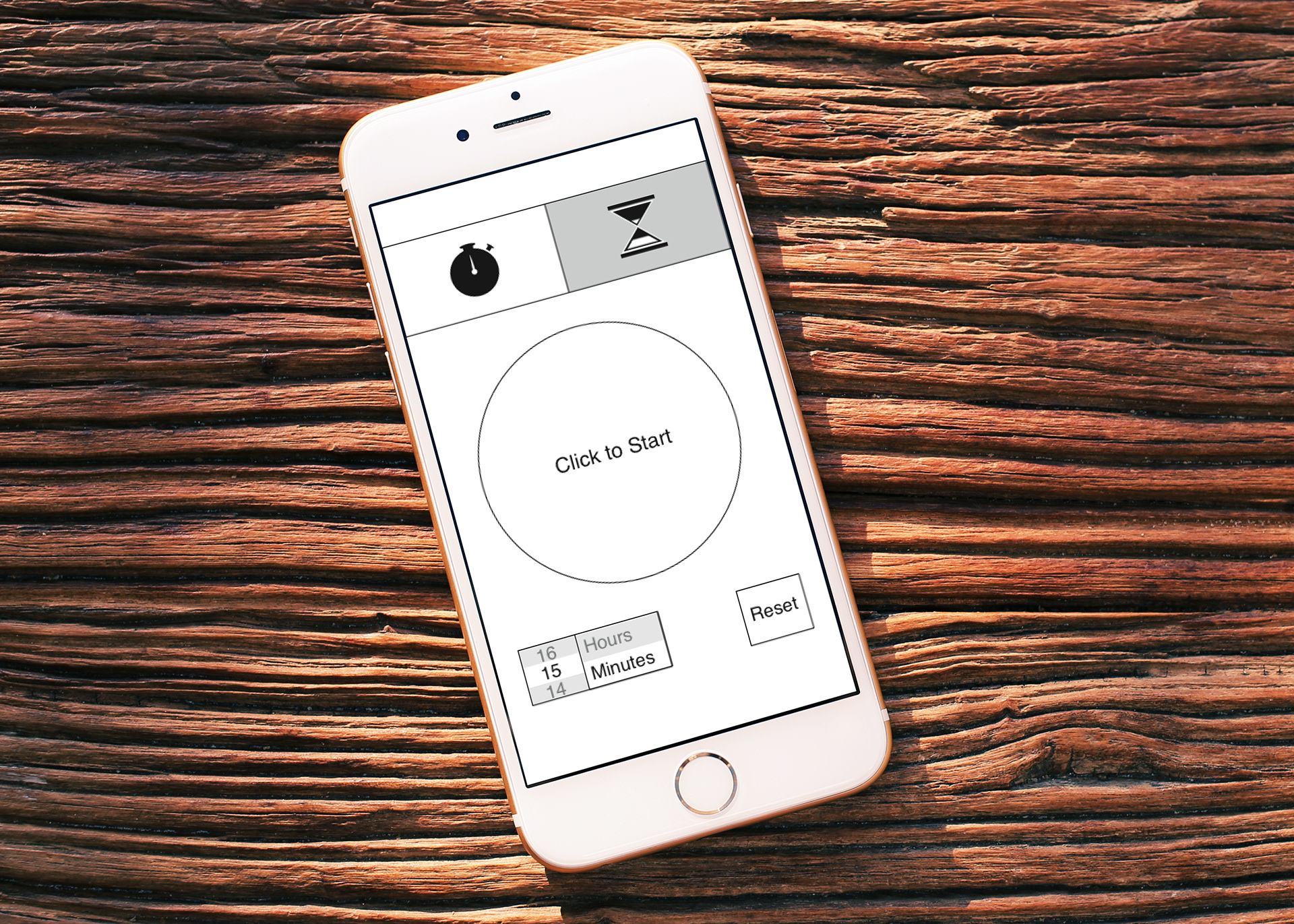
Timer 3 Close up
Step 1 RESEARCH
The research for this project was done by observing various trends seen in timer apps of all kinds.